Better Tutorials for Better Learning

Overview

The Covalent Bonding game is used in high school chemistry classrooms to teach fundamental bonding concepts through play. The game was designed around the core idea that as students learn to play the game, they learn chemistry. After the initial launch, we discovered that users often had a difficult time understanding what to do and/or how to do it, and that the learning could only be as strong as the tutorials.

Our goal: Redesign the tutorial flow and help menu to ease the struggle around learning the rules and interactions so that users could focus on playing through the levels and mastering the concepts.

Platform: Web and tablet
Role: Creative Director (UX design: tutorial flow, visual/text hints, content leveling; visual design direction; user testing)
Team: Adam Aleksa, Sr Developer; Deja Jones, Visual/UX Design; Lindsay Plavchak, Content & Outreach Manager; Ed Wang, Pedagogy Director
Time frame: 8 weeks

Research

User groups

The Covalent Bonding game has main user groups:

Chemistry students

Primary users

Chemistry Teachers

Secondary users and purchasers

User research

To identify the pain points our user groups were experiencing we:

Observed students and teachers using the game in the classroom

Analyzed game play and usage data from the prior school year

Collected feedback and observations from conference interactions and workshop sessions

Conducted teacher focus groups around ease of use and adoption

The Problems

Core issues

Based on our research, we identified the following pain points that were preventing users from having a great experience. Some issues were experienced by both students and teachers, some by only one group.

1. Clunky interaction prompts

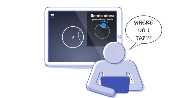
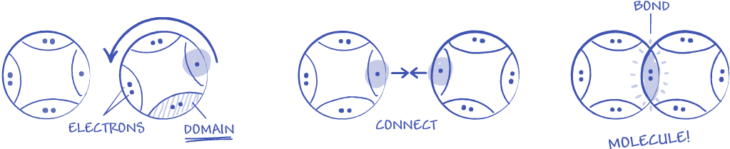
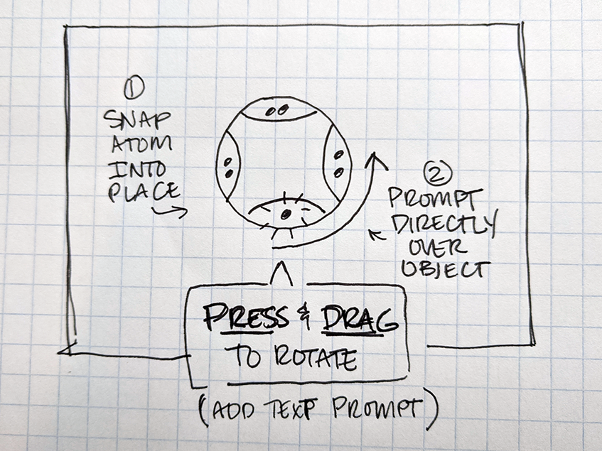
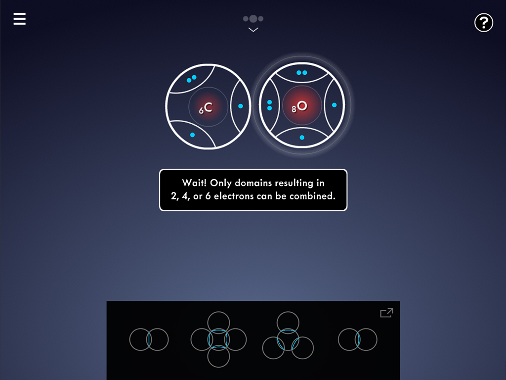
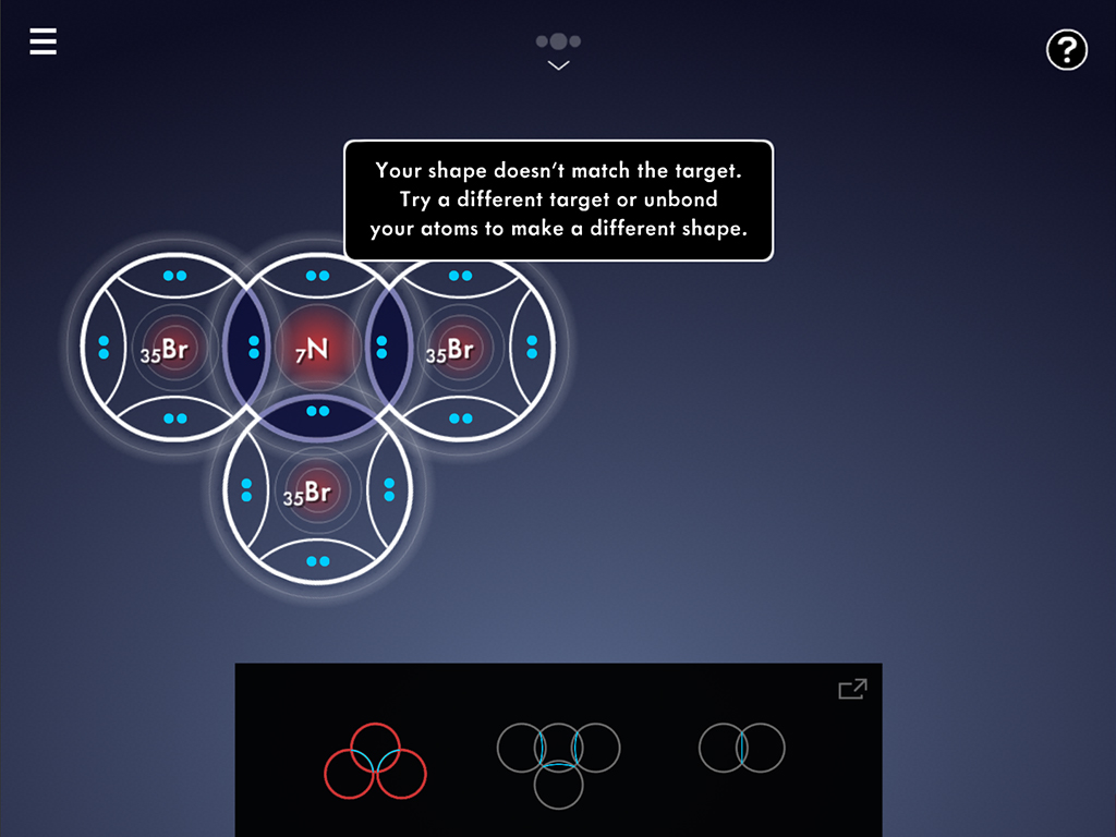
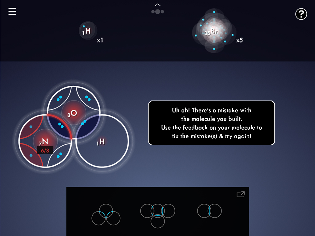
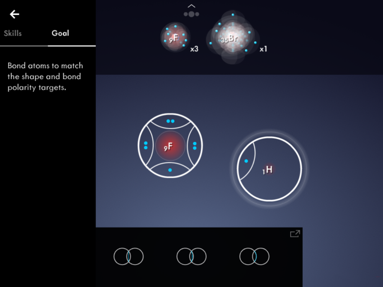
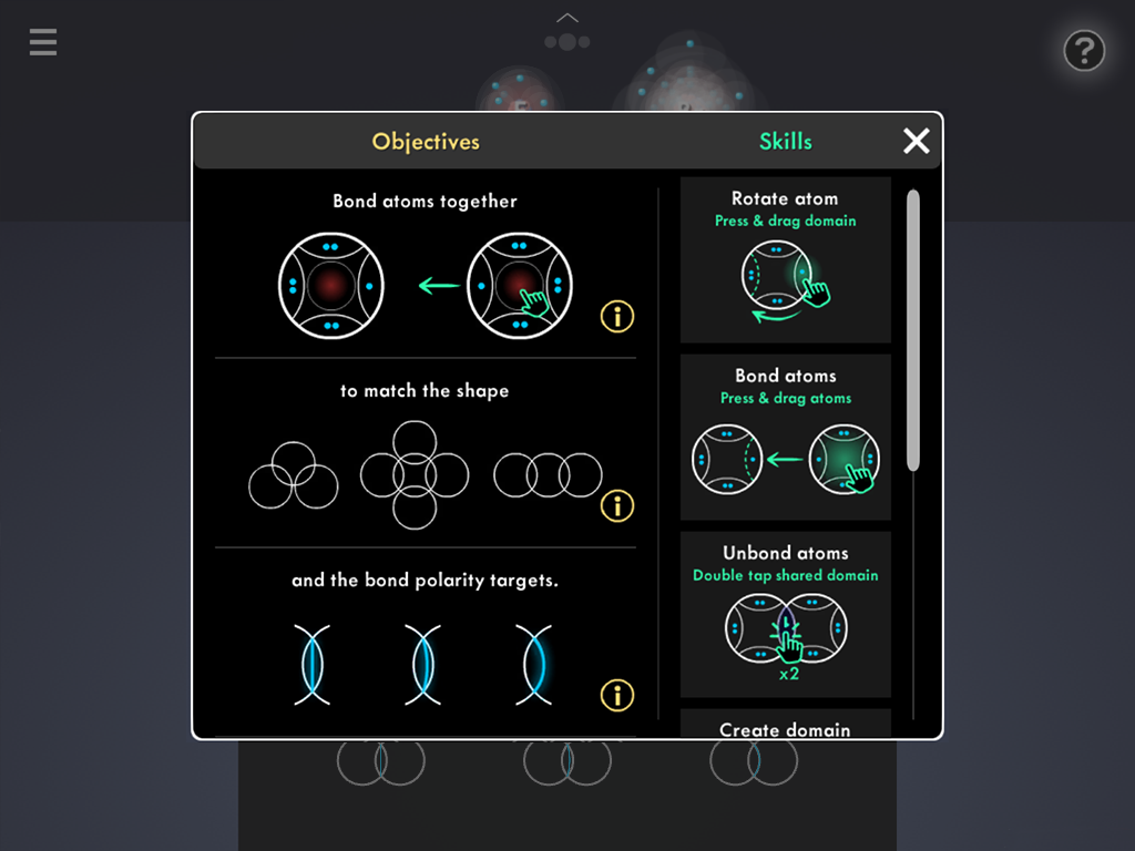
The interaction prompts weren't intuitive for either group. Teachers especially found them confusing and hard to follow.

2. Lack of content clarity and support

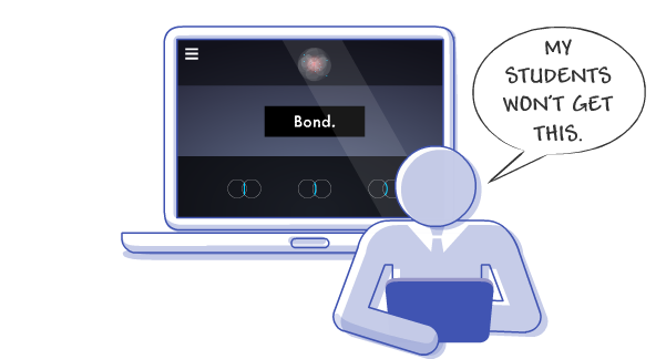
Teachers felt their students wouldn't "get it" without more explicit instructions and direct ties to the curriculum.

3. Difficult to remember critical interactions

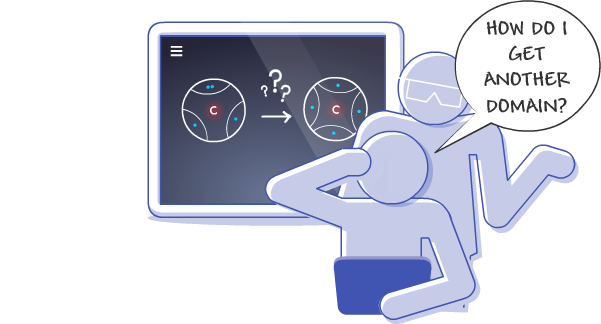
Both students and teachers would forget how to perform interactions. Often they knew what they wanted to do, they just couldn't remember how to do it.

4. Help menu hard to find (and not very helpful)

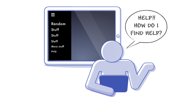
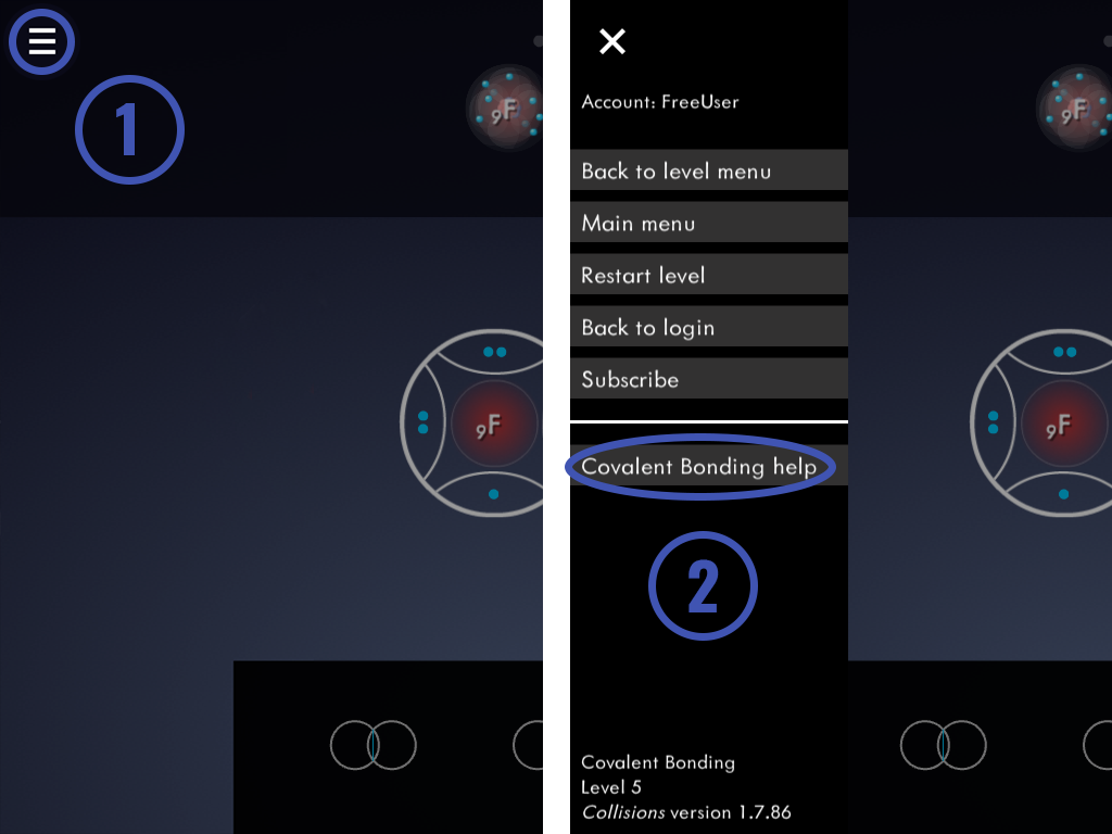
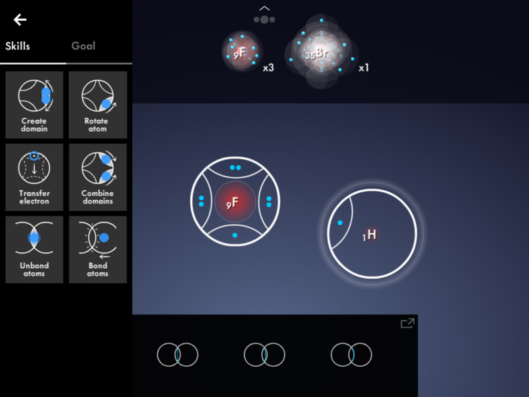
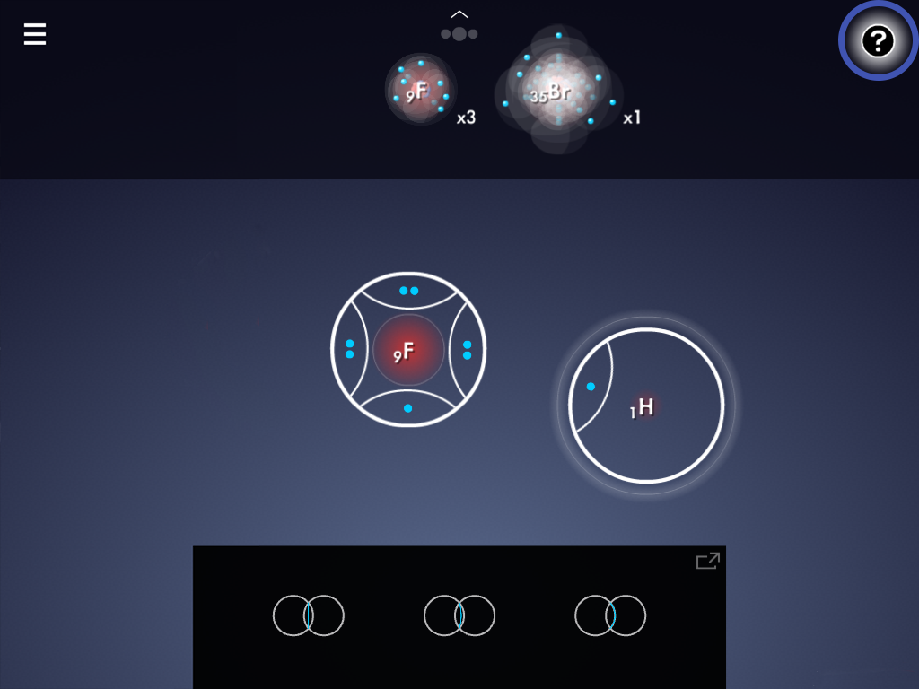
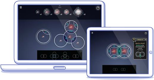
The help menu was buried in the main navigation menu and took two clicks to access. The info inside was limited so once found, it often didn't solve the user's issue.

Solution 1

Improved interaction prompts

During the game, users needed to rotate, connect, disconnect, split, and merge domains in order to create bonds to form molecules.

Basic interactions required for gameplay: rotate and connect domains

The problem: The old interaction prompts appeared in the corner and mimicked what the user should do on a fake atom. Users would often try to interact with the prompt, rather than the intended object resulting in a high level of frustration. The web version also showed a mouse, which didn’t translate well for track pad users.

The old rotate prompt for touch

The old rotate prompt for web

The goal: Our goal was to layer the interaction prompts directly over the object to eliminate confusion over where to tap.

In the old version, users could drop the atoms anywhere on the screen. To ensure that the entire prompt was always visible no matter where the user dropped the atom, we explored snapping the atoms to a set location in early levels. This would also ensure that the atoms were in the correct location to be bonded in the next step of the tutorial.

Early sketch of prompt with added text for clarity

While layering the prompt directly over the object eliminated the confusion over where to interact, we still needed a way to signal to users where to stop rotating.
An early rotate prompt iteration that needed a way to cue users when to stop rotating.

We tried various options to cue the user where to stop. The solution needed to be clear, non-obtrusive, and well timed, and overall intuitive. Early user testing helped guide the iterations.

clean, but not very clear

better, but the dots on dots were unclear

focusing on the domain rather than the electron was better but still cluttered

The solution: Splitting the visual prompts into two steps provided the clearest experience.

First, a pulsing interaction glow cues the user where to press while an animated arrow illustrates the direction to drag. Green differentiates prompts from in game elements and provides a consistent visual interaction cue throughout the game.
Then, once the user begins to drag, a dashed outline of the target location appears. Fading back non-active domains reduces visual clutter and helps the dashed target line pop.

Step 1: Pulsing glow and animated arrow to prompt the user to interact

Step 2: Dashed outline appears to indicate the target location

The final in-game prompt with an added text prompt that helps guide the user and remains visible until the user completes the action

The final in-game rotate prompt shown on web.
In addition to the rotate prompt, all of the interaction prompts received a consistent treatment to help teach users how to play the game. We used the same prompts for touch and web with the exception of interactions that required multi-touch. These received unique treatments specific to the input type.

Solution 2

More guiding text, visuals, and hints

The problem: The old game relied on the user to explore and make their own connections to classroom curriculum. This left teachers lacking confidence in the strength and validity of the game, and students feeling lost. Teachers, and surprisingly students, wanted more explicit ties to curriculum through spelled out/direct vocabulary and concepts.

The goal: Surface the strong, robust content in the game so teachers could quickly see value and feel confident having their students play. Provide context and the right information at the right time to make it clear to students how their actions in the game tie directly to what they learn in class.

The solution: We provided context for player actions by framing the interactions with content and game objectives. This also helped surface the concepts embedded into game play quickly for teachers who might just play through the first few levels.

In the following example, we start Level 1 with key information about valence electrons, how many are typically needed, and that they can be shared between atoms. This sets the stage for what the user will be doing and why

Level 1 – building understanding of valence electrons, their desire to be paired, and sharing to achieve this

Based on user testing, usage data, and our observations we also identified common sticking points to add more useful hints. We made sure that the hints would always give the player a course of action while not giving away the solution.

user tries to bond an odd number of electrons

user drags a molecule to an incorrect shape target

molecule meets shape target but fails check

Solution 3

Improved leveling

The problem: In the old tutorial flow, all of the interactions were grouped into the first 4 levels, with little time to practice new skills. By the time those skills became relevant, users had often forgotten those critical interactions.

old leveling with interactions and content introduction grouped in the beginning levels

The goal: While bonding is complex and all of the concepts are all directly interrelated, we wanted to separate them out a bit to give the user time to practice newly learned interactions and concepts.

The solution: We grouped the concepts and corresponding interactions into more digestible chunks and added practice levels after each new set of concepts. This introduced each concept and its interactions gradually so the user would have time to practice them before moving on.

new leveling with interactions and content introduction spread out with practice levels in between

Solution 4

A better help menu

The problem: The old help menu was hard to find and only contained buttons to replay the interaction prompts. This was helpful if a user forgot how to do something but we found that sometimes, the user wasn’t sure what they needed to do. Users needed help remembering the rules of the game (rules of chemistry) before they could determine what interactions were needed.
The old help menu was accessible only through the main menu button and took two clicks to get to.
Interactions were the primary focus with the goal as the secondary focus, located on second tab.

The solution: We added a dedicated help button for easy direct access to the help menu. Once opened, we made the level objective the primary focus and the interactions (or “Skills”) the secondary focus. We also added clarifying images and additional content help available for each step.

The new help menu received a dedicated button for easy direct access.
Objectives and interactions now appear side by side with clarifying images and additional content help available for each step.

The results

  • Teachers are now able to progress through the tutorials in workshops and focus groups without confusion and students are able to progress through the levels with a focus on game play and content instead of struggling to remember the interactions.
  • Increased usage by 96% over the same 3 month period (when bonding typically falls into the curriculum) compared to the prior year.
  • Nominated for a 2019 Webby for Best Education Game

It is in an achievement-oriented game format, where tutorial levels help guide students to discover the rules by which matter behaves.

I love the game and the ease of use.

I was pleasantly surprised by how engaged my students were.

It is great for getting students engaged. There are good systems of modeling in the game that are hard to get anywhere else.

Watch a video of tutorial highlights from the Covalent Bonding game below!